Create and Colour with Stitches
Distant Stitch Level 3 Embroidery Certificate
Wednesday 18 February 2015
Colour Circle
The colour circle is a tool to help in the combining of colours.
Primary, Secondary and Tertiary Colours
The primary colours are red, yellow and blue.
The three secondary colours (green, orange and purple) are created by mixing two primary colours.
The six tertiary colours are created by mixing a primary and a secondary colour.
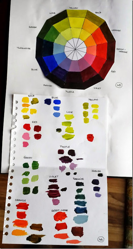
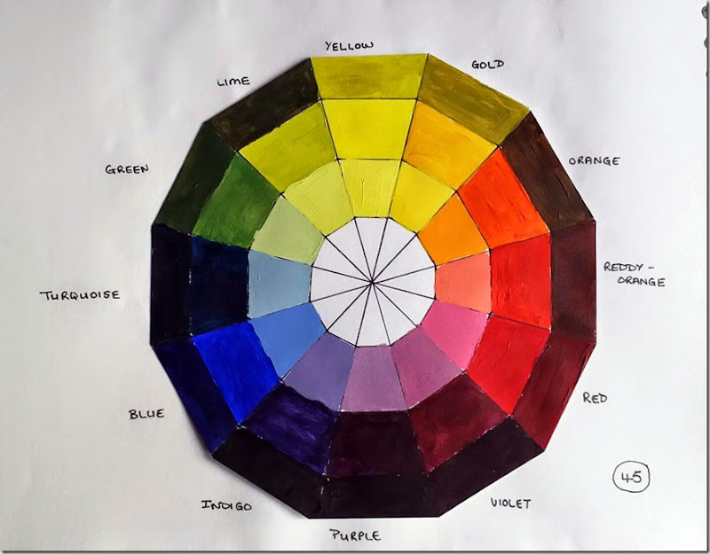
I have used acrylic paints to fill in my Colour Circle using the following colours:
Daler-Rowney System 3:
Cadmium Yellow Hue (warm); Lemon Yellow Hue (cold)
Cadmium Red Hue (warm); Crimson (cold)
Ultramarine (cold)
Winsor & Newton Galleria:
Cobalt Blue Hue (warm)
Titanium White (tints)
Black (shades)
The colour circle was painted on an A4 cartridge paper. Mixing the paints on a plate and then testing these on the trial sheet before adding the colours to the circle. These trials are shown in (46).
The shades on the lower half of the circle (Turquoise through to Violet), I found it difficult not to add too much black and thereby making the shades very dark.
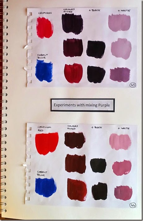
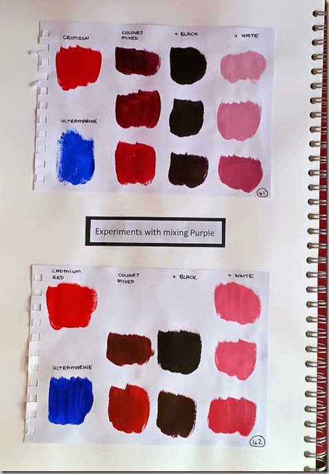
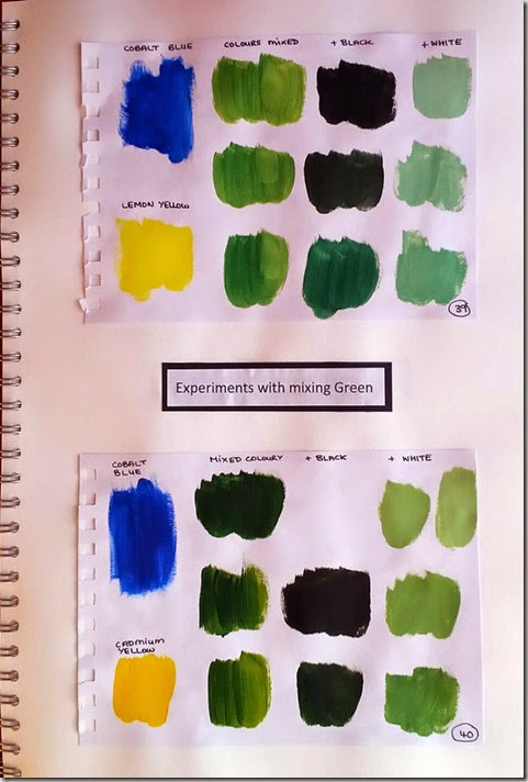
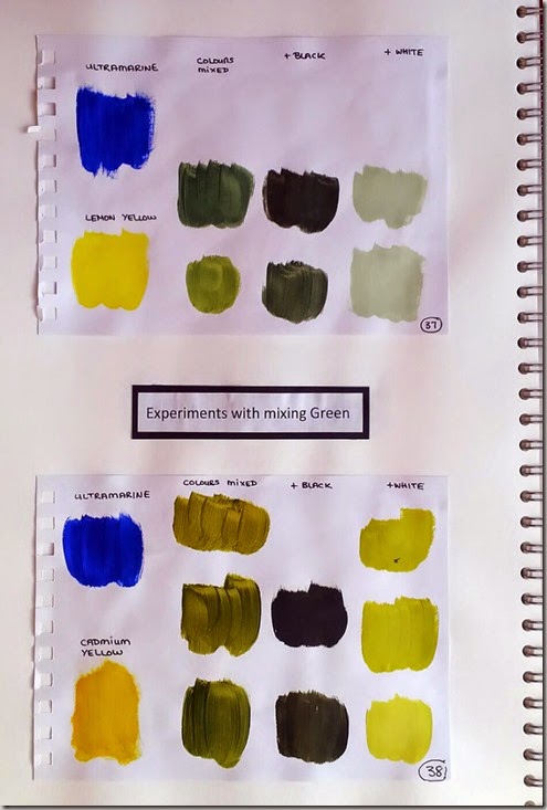
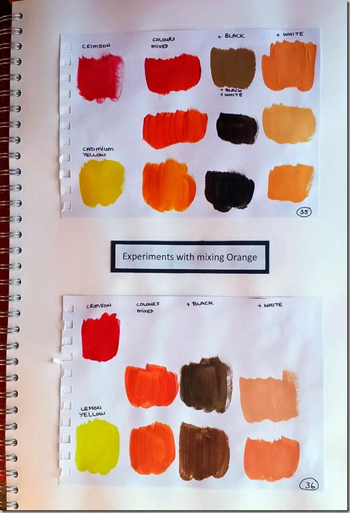
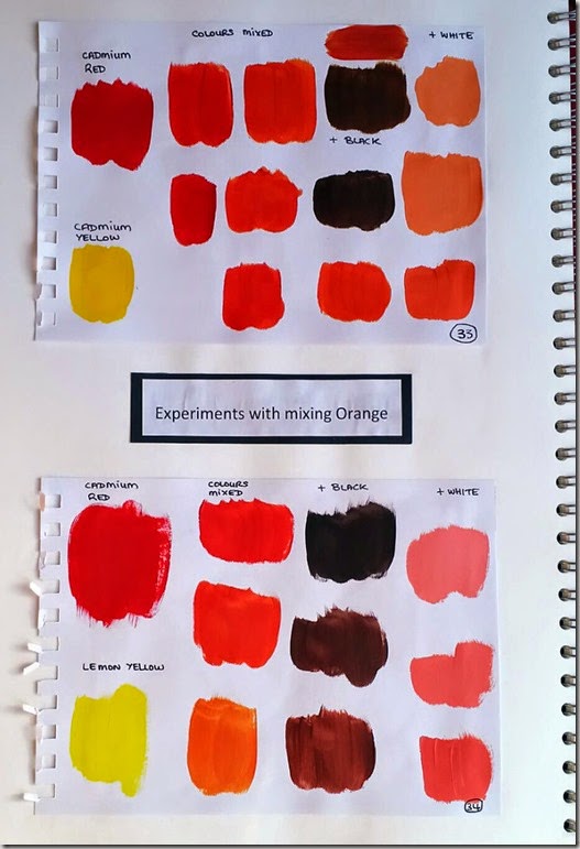
Before filling in the circle I practiced mixing the colours together. This was a good exercise, because I had not realised how much the colours within the two spectrums of cold and warm could react with each other. Although they were making a colour with a broad covering name (i.e. green) the diversity produced was very interesting.
I found that in the mixing of the paints I needed to add the darker of the colours to the lighter (therefore needing to use less paint) making the process easier to mix the paints together. A very small amount of black was needed, otherwise the colour was very quickly made too dark. Whereas with the white more was needed to get a good tint colour.
I wanted to take it further than the Tutor Hints for mixing the Secondary colours, so I worked on the combinations suggested but also a combination of each of the warm and cold colours.
I have included all the trials in my sketchbook, as I feel they are a good reference tool for the future.
Out of all the colour mixing I felt the achievement I enjoyed most was seeing how I could produce such a wide selection of greens. Only needing to have eight tubes of paint is also a revelation to me, whereas before I have always felt I have needed to buy the full range of colours. It has given me a sense of achievement to see how I can mix these paints and get so many delightful colours from them.
Tuesday 17 February 2015
Rubbings Revealing Cross Images
Rubbings – An impression of an embossed or raised surface made by placing a piece of paper over it and then rubbing over the paper with a pencil, wax crayon or other colouring medium in a solid form.
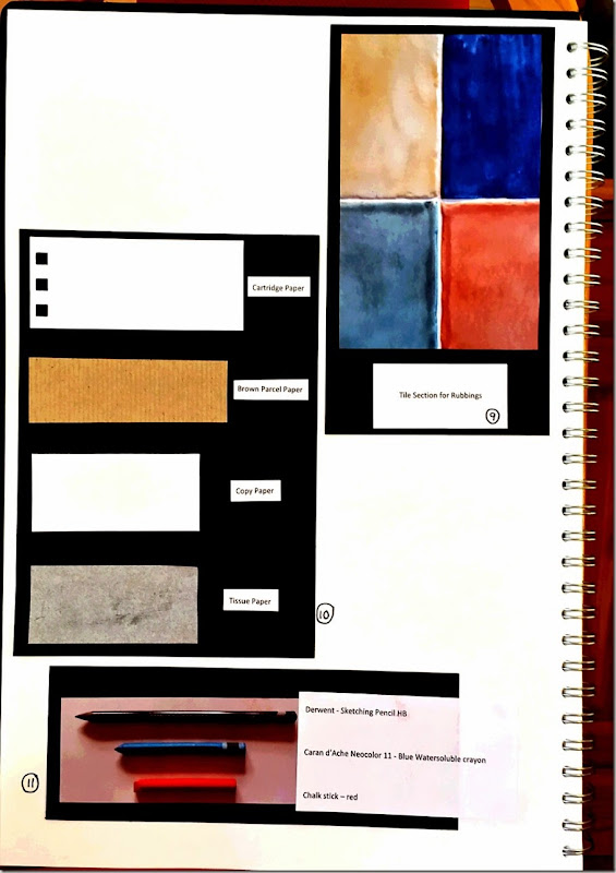
I chose to use the cross shape in between some of the tiles in my house (9). These are raised and have a slight uneven edge which I hoped would produce a good and interesting rubbing.
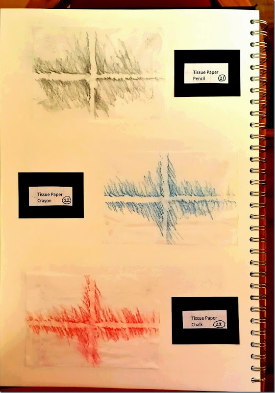
These rubbings were made with a HB Derwent Sketching Pencil, a Blue Watersoluble colour crayon from Caran d’Ache Neocolor 11, and a red stick of chalk. (11)
The papers used were 140 gsm cartridge paper, brown parcel paper, copy paper, and tissue paper. (10)
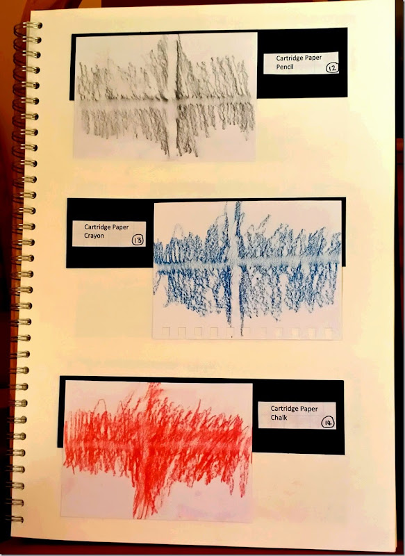
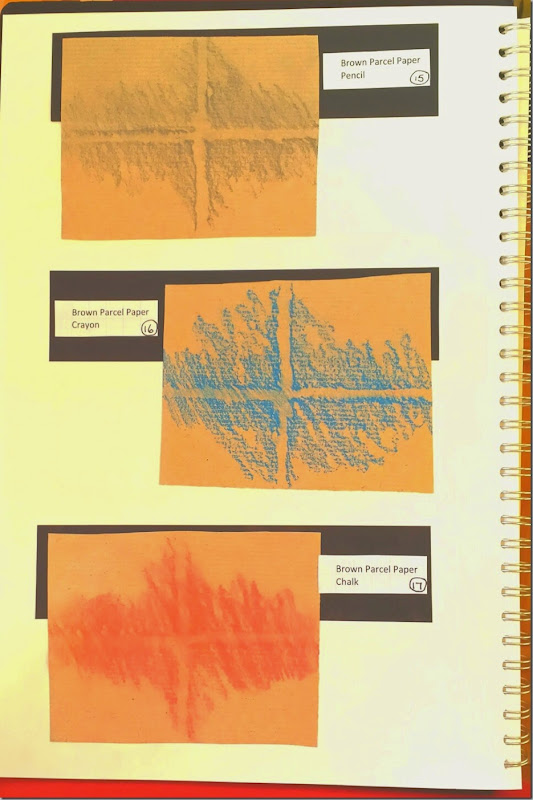
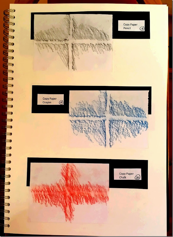
Using each of the colouring mediums on each type of paper I proceeded to see which combination would produce a clear copy of the cross shape between the tiles.
Both the pencil and crayon produced good rubbings compared to the chalk stick. However I do feel the crayon, in most cases, produced the clearest images. It was able, due to the softer nature of the wax, pick out the intricate edges. The chalk stick images are not always clear and the chalk powder seemed to be too thick to pick up the difference in the edges of the tiles and the indentation of the grouting. The pencil did produce some good images, and if you only had this option to hand it would be a good alternative to the crayon.
The papers that I felt produced the best images were the copy paper and brown parcel paper with all mediums. They were both quite pliable, therefore allowing the mediums to ‘feel’ the indentations underneath them. Whereas I had the most trouble with the tissue paper, in some cases the rubbing medium caught it and there are slight tears in the paper. The cartridge paper, although was able to produce an image, was just too thick to pick up all the indentations.
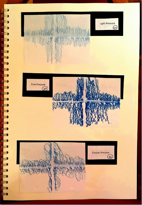
I had used the same pressure and direction of rubbing for all the above tests. I then wanted to see what would happen if I tried different methods of rubbing. I chose the copy paper and crayon to try these out, the combination from the previous tests that I found had made good impressions.
The first trial was to press very lightly with the crayon and only use it in one direction across the paper, and not going over it more than this once (24). I got an impression but, as probably was expected, it was not a very clear one. Then I pressed very firmly with the crayon, using it from side to side and going over my marks more than once (25). A very clear impression that almost seems 3D was made. Lastly, I tried going over the paper with a circular motion (26). I like the impression that it gave and the effect of the circles defines the cross shape with an interesting pattern surrounding it.
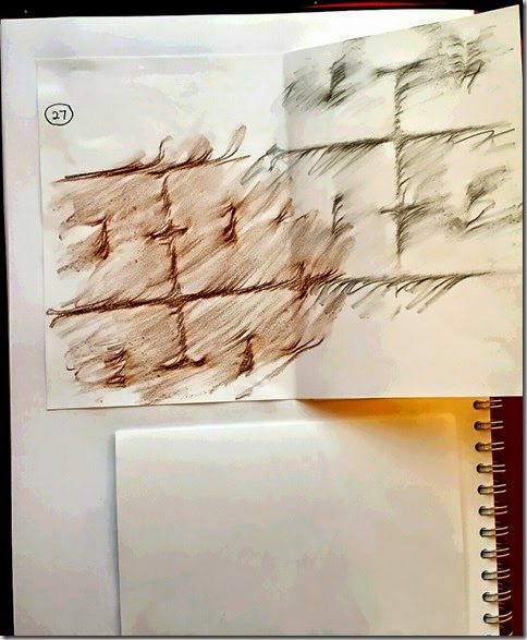
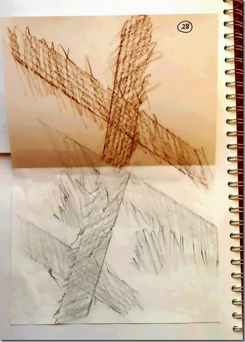
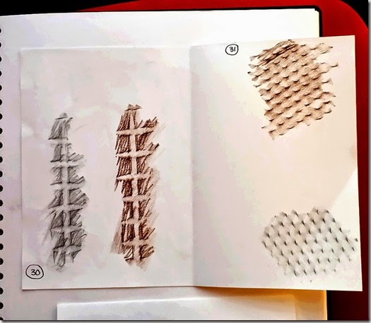
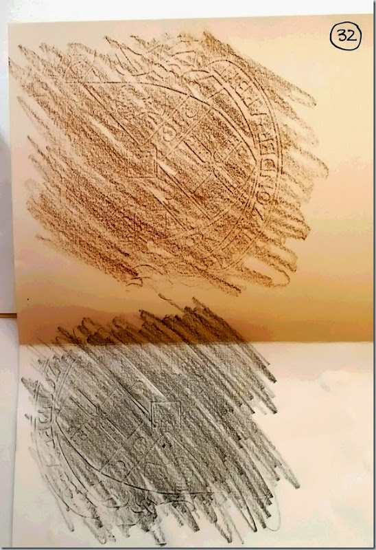
Nos. 27-32. These are some trial rubbings I worked on before choosing the tiles. They have been worked on a 100 gsm paper and the same pencil and crayon (although brown in colour).
(27) the the manhole cover seen in the photos under Man Made. Produced a good rubbing with both mediums but was rather large to carry out many trials on (and it started to rain when I was working on this section).
(28) fence panel seen in the photos under Man Made. It was not easy to keep the paper in place to make these rubbings (and it started to rain when I was working on this section).
(29) a yoga roll. Not a very good choice, although the impression on the roll looked like it would produce a cross pattern.
(30) the side of a glass vase. Produced a clear cross pattern with the crayon, but it was difficult to manipulate the paper and rubbing medium on the side of the vase due to its shape.
(31) grid on a fan cover. This had a clear cross grid but when I tried to produce a rubbing, neither medium showed the cross grid.
(32) the emblem on the waste bin seen in the photos under Man Made. Although this emblem felt embossed when I touched it, the rubbings produced are very faint and one side almost non existent.
Sunday 8 February 2015
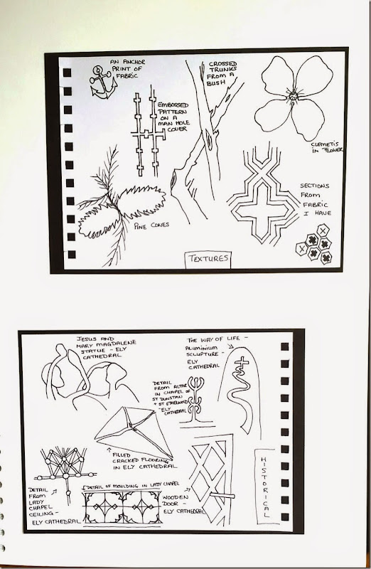
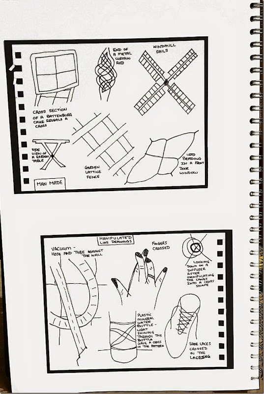
Line Drawings of the Cross Shape using my Research Images
I have used my research images to base these line drawings on.
Choosing a few images from each of my themes, not only those that I felt transferred to line drawings well, but those which I liked the shape and form of.
As I am not confident in my drawing skills I have used tracing paper to get the basic shape down on to paper. Using a B sketch pencil to trace the outlines from the images and then to transfer to paper. I then used a Sharpie Black Ultra Fine pen to go over the pencil lines, making for a clearer image.
I have included a note by each outline informing what it represents.
Wednesday 4 February 2015
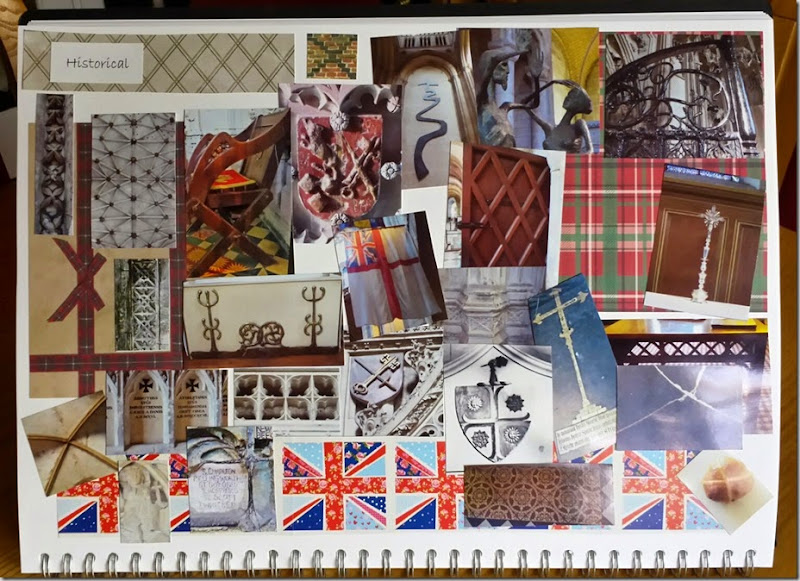
Research Images - Historical
The following photo is my pin board for Historical images of the cross shape. These include my photos, items found in magazines etc., and decorative papers. They have been arranged in an A3 Sketchbook.
Research Images - Texture (Natural and Manmade)
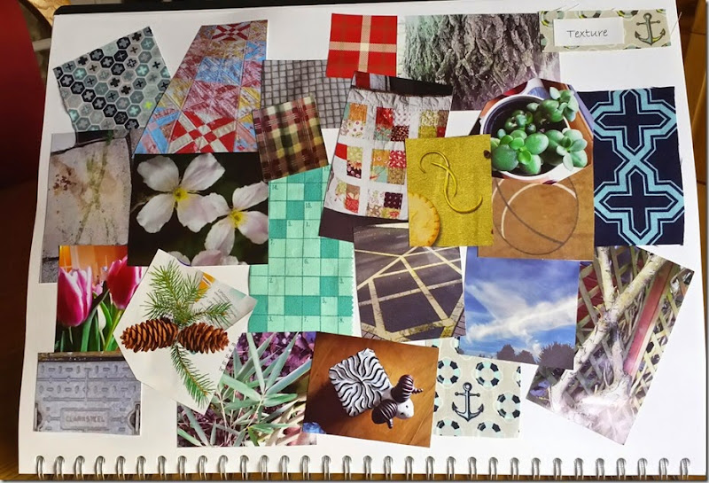
The following photo is my pin board for Textural images of the cross shape. These include my photos, items found in magazines etc., and decorative papers. They have been arranged in an A3 Sketchbook.
Research Images - Manipulated
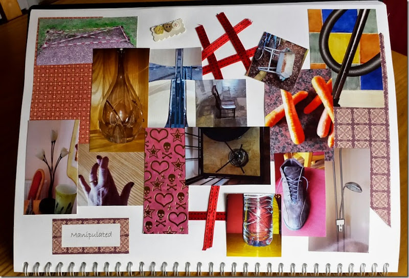
The following photo is my pin board for Manipulated images of the cross shape. These include my photos, decorative papers, ribbons and found items around the house. They have been arranged in an A3 Sketchbook.
Research Images – Man Made
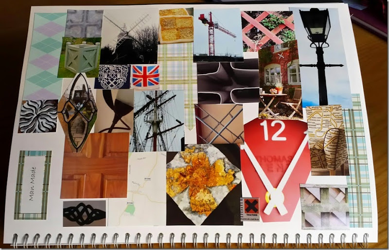
The following photo is my pin board for Man Made images of the cross shape. These include my photos, items found in magazines etc., and decorative papers. They have been arranged in an A3 Sketchbook.
Researching Crosses
My theme for Module 1 will be Crosses.
Below are some definitions of the word Cross.
- Structure with 2 intersecting lines – crossroads
- Emblem of Christianity – Crucifixion of Jesus, Celtic cross
- Mark with 2 intersecting lines – error mark, crossing out
- Symbol for help – Red Cross
- Symbol of warning – ‘for poisons’
- Pipe fitting – connection of 4 pipes
- Heraldry – shields, emblems
- Medals – Victoria Cross, Maltese Cross
- Angry – ‘cross with something/somebody’
- Mixture or combination of two types of qualities – mongrel dog
- Crossword puzzle
- Traverse – ‘cross the road’
- Span – ‘bridge crossing a river’
- Good luck - ‘Fingers crossed’
